Themes & fonts
Editora Light and Editora Dark, plus 26 more (Primer, Nord, Cupertino, Dracula and the community set). Five bundled monospace fonts, no install needed, and you can drop in a theme of your own.
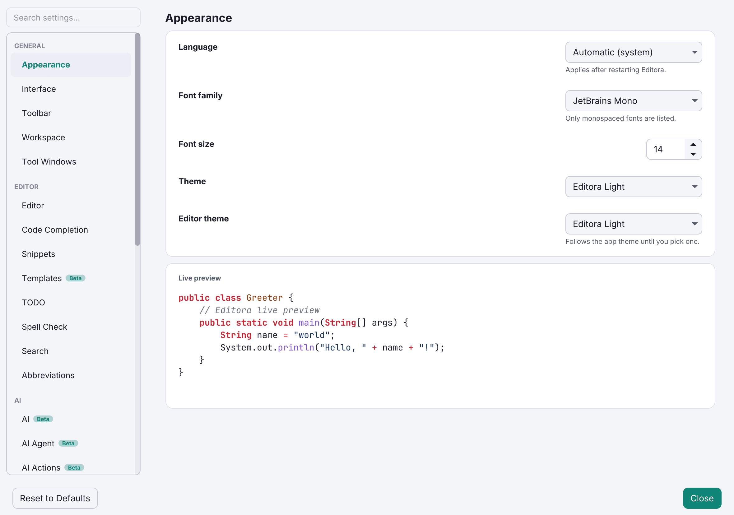
Editora Light and Editora Dark are the app’s own pair, drawn from the palette in its icon: a teal accent, an ink-navy ground, and a periwinkle reserved for keybindings. They are what a fresh install starts in.
Twenty-eight themes ship in total: the Editora pair, Primer, Nord and Cupertino (each light and dark), Dracula, and nineteen community themes in twelve families (Army, Autumn, Blacky, Blue, Browny, Fall, Navy, News, Spring, Summer, Winter, Yacht).
Each one themes the syntax tokens, the editor surface, the gutter and the project tree together. The editor theme follows the app theme until you pick one explicitly, after which the two are independent.
One vocabulary for state
Colour means the same thing everywhere. Amber means “not saved yet” on the tab, the Switcher, the file tree and the pickers, and it follows the theme rather than being one fixed value that only suited a light background. Red is broken, green is verified, olive and violet are git’s untracked and renamed, and periwinkle is only ever a keybinding.
Fonts
Five monospace fonts ship with the app (JetBrains Mono, Cascadia Code, Fira Code, IBM Plex Mono and Source Code Pro), so nothing needs installing, and there is per-editor text zoom. The interface itself is set in Inter on every platform, so Editora looks the same wherever you run it.
Bring your own
Drop a stylesheet into themes/ in your config directory for a full app theme, or into editor-themes/ for syntax colours only. It appears in the picker under its filename, and Reload User Themes re-scans without a restart.