
Themes & fonts
Appearance settings live in Settings → Appearance, which includes a live preview that recolors as you change things.
Themes
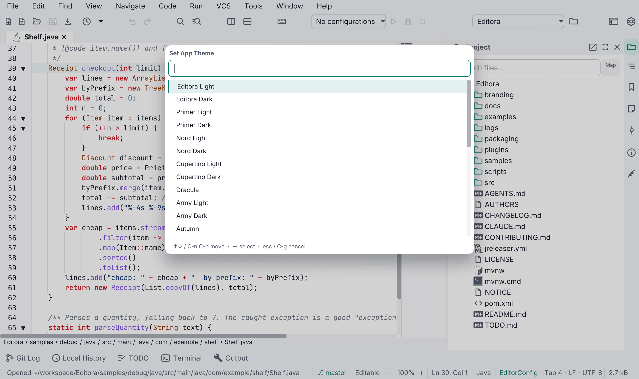
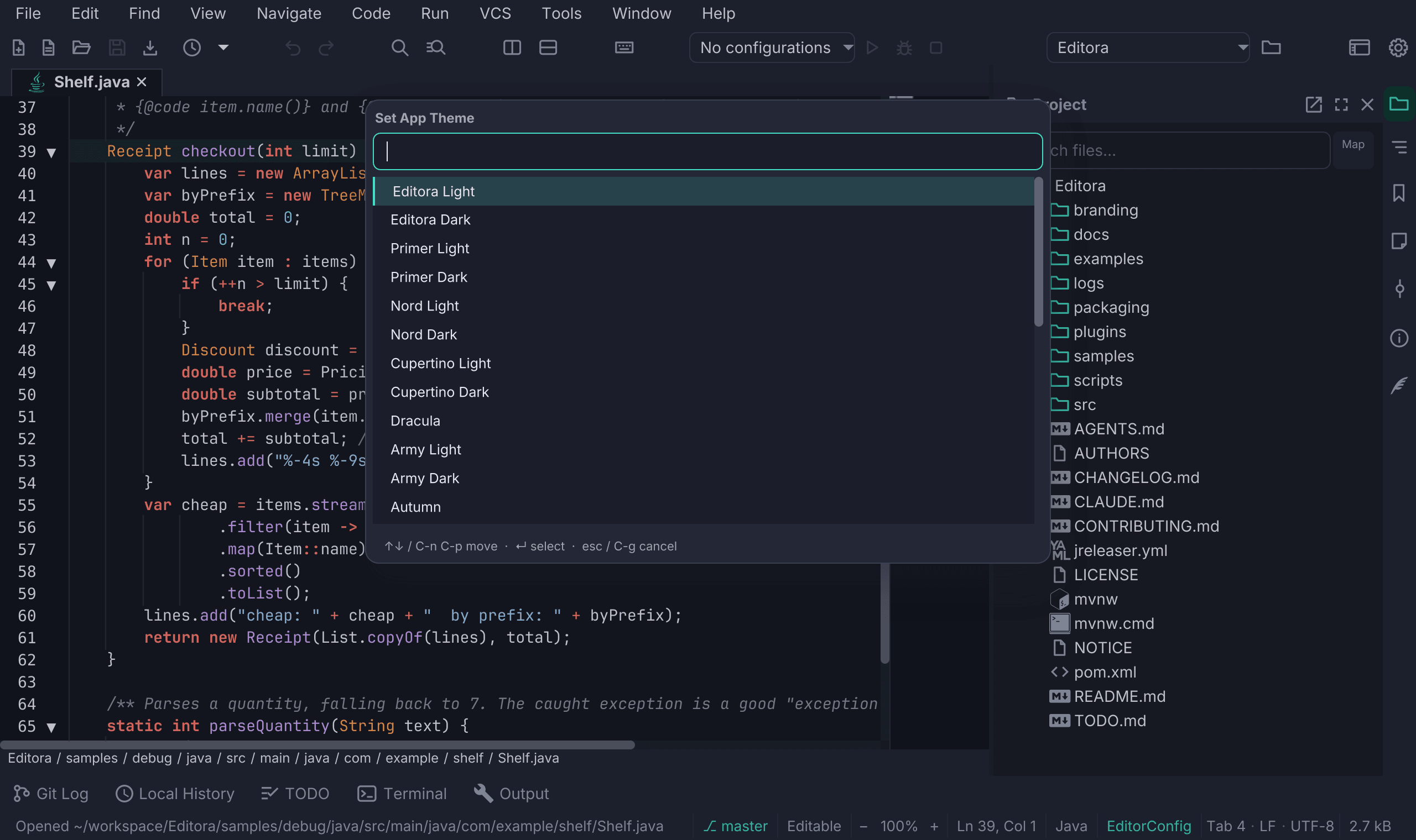
Editora Light and Editora Dark are the app’s own pair, drawn from the palette in its icon: a teal accent, an ink-navy ground, and a periwinkle reserved for keybindings. They are what a fresh install starts in.
Twenty-eight themes ship in total:
- Editora (light and dark), the default
- Primer (GitHub-style), Nord and Cupertino, each in light and dark
- Dracula
- A community set of nineteen themes in twelve families: Army, Autumn, Blacky, Blue, Browny, Fall, Navy, News, Spring, Summer, Winter and Yacht (seven of them in light and dark)
The app chrome is themed by AtlantaFX; the editor surface, gutter, syntax tokens and project tree are themed separately. The Editor theme picker starts with Automatic, which follows the app theme. A theme you pick there stays when the app theme changes; choose Automatic again to go back to following it.
Both pickers group the themes under Light and Dark headings, with the members of a family next to each other. Your own themes are listed last, under Your themes. The headings are titles only: the mouse and the arrow keys pass over them.
The terminal follows the editor theme too, unless you give it a color scheme of its own in Settings → Terminal → Theme.
What the colors mean
Colors carry a fixed meaning across the whole interface, and they follow the theme rather than being fixed values that only suit one background:
| Color | Means |
|---|---|
| Amber | Not saved yet — an unsaved tab, a read-only or narrowed buffer, a snapshot |
| Red | Broken |
| Green | Verified |
| Olive / violet | Git’s untracked / renamed |
| Periwinkle | A keybinding, and only ever a keybinding |
Keyboard chips (in the command palette, the Welcome page, menus, and the Settings window’s Keymaps page and shortcut fields) take their colours from the app theme, whatever the editor theme, so they stay readable on every bundled theme.
The Markdown preview can be themed independently of the app with its own light/dark toggle (a sun/moon button on the preview’s zoom control), so you can read a GitHub-style light page inside a dark editor.
User themes: drop your own theme CSS in a themes/ (app + editor theme) or
editor-themes/ (editor only) folder in your config directory,
and it joins the picker under its file name. The Your own themes row on the
Appearance page has Open themes folder and Reload themes links;
Theme: Reload User Themes (theme.reloadUserThemes) does the same reload from
the palette, without a restart.
Fonts
Five monospace families ship with the app, so nothing needs a system install:
- JetBrains Mono (default)
- Cascadia Code
- Fira Code
- IBM Plex Mono
- Source Code Pro
They’re listed first in the font picker, marked “(bundled)”, ahead of your system’s monospace families. Only monospaced fonts are listed. A weight or style that a font installs as a family of its own (such as “IBM Plex Mono Light”) is left out when the family itself is listed, and so are math and symbol fonts.
The interface itself is set in Inter on every platform, so Editora looks the same wherever you run it rather than inheriting each system’s default UI font. The Markdown preview and PDF prose use Inter too.
Text zoom
Zoom the editor text independently of the configured font size:
| Action | Default key |
|---|---|
| Zoom in | C-= |
| Zoom out | C-- |
| Reset | C-0 |
The commands are View: Zoom In Text, View: Zoom Out Text and View:
Reset Text Zoom (view.textZoomIn, view.textZoomOut, view.textZoomReset),
under View → Zoom in the menu bar. Ctrl+wheel zooms too, and the status bar
has − / + buttons. When the active buffer is a Markdown preview, the same
gestures zoom the preview instead of the editor text, and with an image or a
PDF in the active tab they zoom it, as its −, + and 1:1 buttons do. The
zoom level is saved as fontZoom. It has no field in Settings,
but while the text is zoomed the Appearance page says so under Font size
(“Text zoom is 160%, so the editor and the preview show 29 px.”) with a
Reset zoom link, and the live preview uses the zoomed size.
Interface zoom
The interface zoom scales the menus, toolbar, tabs, tool windows, dialogs and status bar together, from 80% to 200% in steps of 10%. The editor’s text keeps its own text zoom, so the two can be set apart.
| Action | Command |
|---|---|
| Zoom in | view.uiZoomIn (View: Zoom In Interface) |
| Zoom out | view.uiZoomOut (View: Zoom Out Interface) |
| Reset to 100% | view.uiZoomReset (View: Reset Interface Zoom) |
They are under View → Zoom, beside the text zoom’s commands, and have no default key. Interface zoom on the Appearance page of Settings sets the same value. A change applies to every open window at once and is kept across launches.
Printed and exported pages are not affected. The Print Preview window’s bar and size follow the interface zoom, while its page at 100% is drawn as large as the text around it and prints exactly as before.